Data Science
Chicago bike-share equity
Equity Over Time in Divvy’s Chicago Expansion
Twelve years of Divvy trip data joined to ACS demographics by census tract. Station placement became geographically equitable across the expansion; per-capita ridership diverged along the same lines it was meant to close.
Group project for STAT 303-1 (Northwestern). This page covers the sub-analysis I authored; other team members analyzed station accessibility, membership patterns, and safety/mobility separately.
Summary
Divvy is Chicago’s public bike-share system, operated by Lyft under contract with the city. The system has expanded from its original 2013 footprint in downtown and North Side neighborhoods into the South and West Sides over three funding rounds. Equity has been an explicit goal of the more recent rounds.
This analysis asks whether that goal was met. It compares station placement and ridership across three expansion phases and three demographic groupings (predominantly White, Black, and Hispanic census tracts). The access question and the usage question separate: by Phase 3, new stations are distributed roughly equally across the three groups, but per-capita ridership in white-majority tracts is roughly eight times higher than in Black-majority tracts and fifteen times higher than in Hispanic-majority tracts.
Data
Five public datasets are combined. Divvy trip data (2014–2025, restricted to Q2 April–June of each year) comes from the Divvy open data program. Station locations with coordinates are pulled from the Chicago Data Portal. 2010 census tract boundaries for Cook County provide the spatial aggregation unit. ACS 5-year DP05 supplies race and ethnicity counts; ACS 5-year DP03 supplies economic characteristics. Both ACS tables are pulled for 2017, 2022, and 2023 estimates.
Restricting to Q2 holds seasonality constant across years and keeps the data volume manageable. 2013 is excluded: the file for that year contains only about 4,000 rides compared with 700,000+ in later years, and the city’s open-data release schedule changed that year. After all joins, roughly 20% of historical rides are dropped because their start stations are not present in the current station table.
Method
Four steps move from raw CSVs to a tract-level panel that supports the phase and demographic comparisons.
Schema reconciliation across twelve years
Column names, file structures, and datetime formats in Divvy’s public release changed several times between 2013 and 2025. Some years ship a single full-year file; others split the year into monthly files. Column keys shift between from_station_name and start_station_name, and station IDs move between integer and string. A standardize_divvy_data function normalizes column names and keeps only {year, ride_id, start_station_name, start_station_id, started_at} for downstream analysis.
Spatial join of rides to census tracts
The station table (current Divvy Bicycle Stations from the Chicago Data Portal) is used to assign latitude and longitude to each ride by start station name. A shapely.Point geometry is constructed per ride and spatially joined to the 2010 tract polygons with geopandas.sjoin. Rides whose start station does not match the current station file are dropped (the ~20% referenced above).
ACS year mapping
Demographic and economic characteristics drift over a twelve-year window. Each ride is assigned to the ACS vintage whose 5-year estimate centers closest to its ride year: rides in 2014–2017 use ACS 2017; rides in 2018–2022 use ACS 2022; rides in 2023–2025 use ACS 2023. Tract-level race and income variables are attached through this mapping so that a ride’s demographic context reflects the population at the time the ride occurred rather than a single snapshot.
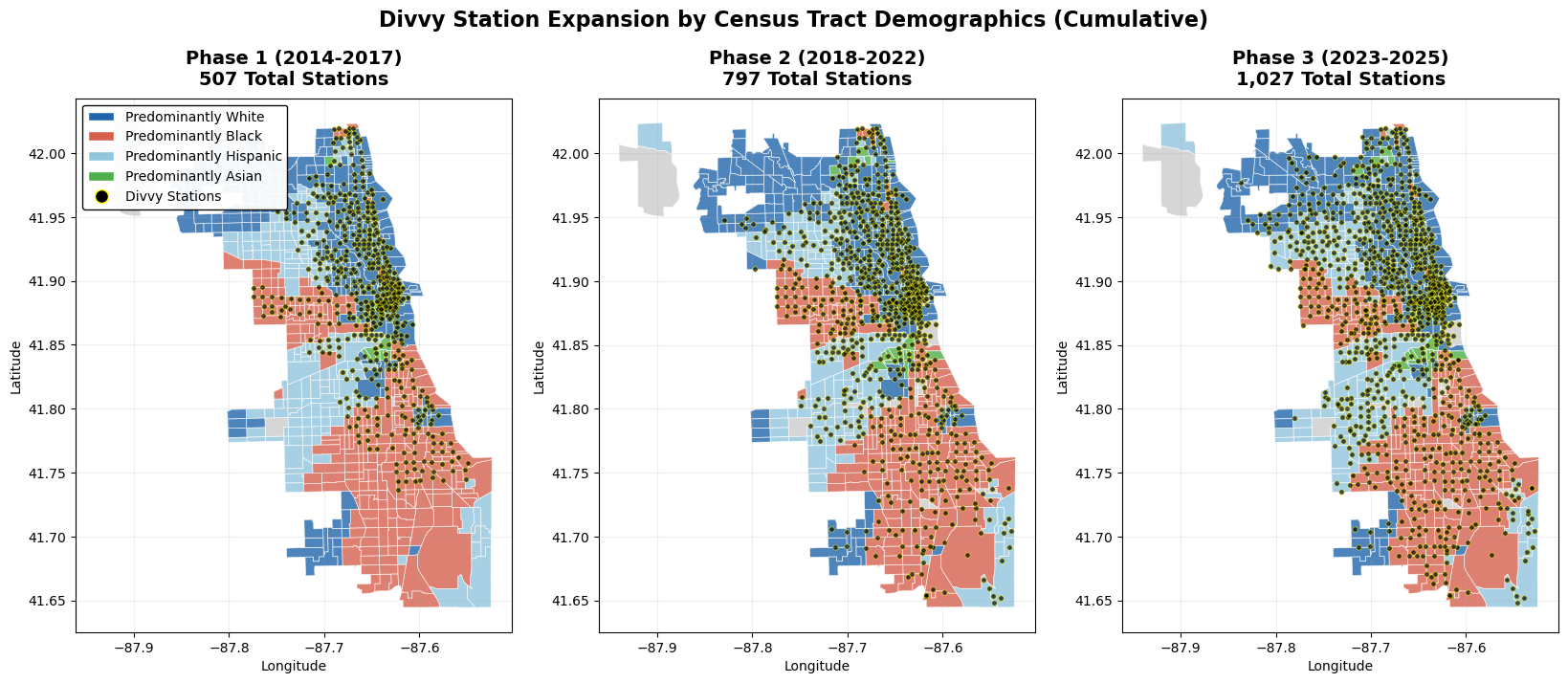
Phase and demographic bins
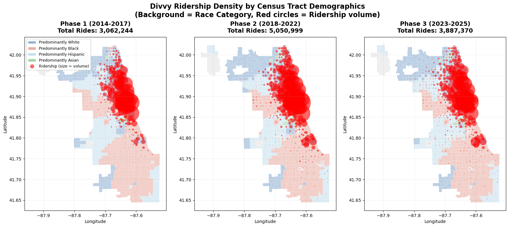
The expansion is split into three phases by year: Phase 1 (2014–2017), Phase 2 (2018–2022), Phase 3 (2023–2025). Tracts are categorized as Predominantly White, Black, or Hispanic when any single non-Hispanic race group exceeds 50% of the population; tracts that fall below the threshold are categorized as Mixed and excluded from the per-group comparisons. Income is binned into quartiles on the tract-level median household income distribution.
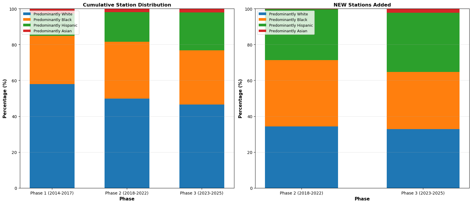
Station distribution by phase
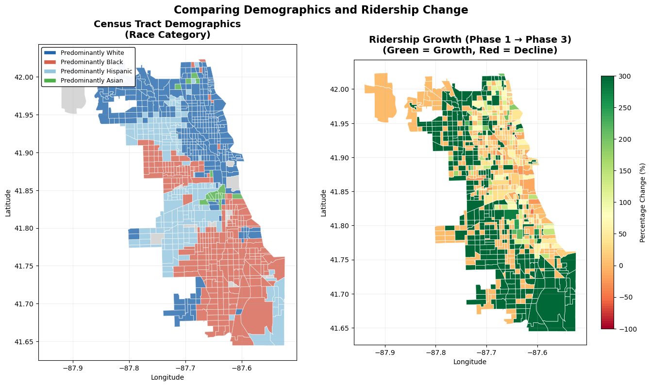
The share of new stations in Predominantly White tracts falls from 57.9% in Phase 1 to roughly one third in Phase 3. The shares for Predominantly Black and Predominantly Hispanic tracts each rise to roughly one third over the same window. By Phase 3, new station placement is nearly uniform across the three demographic groups.
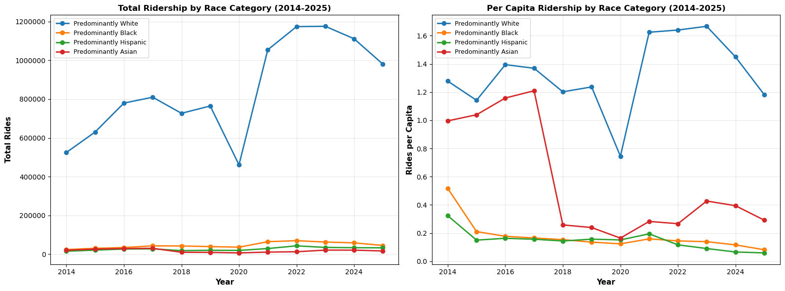
Ridership trends
Total rides and per-capita rides tell different stories. Aggregate ride counts in Predominantly White tracts rise faster than in either of the other two groups. Per capita, the gap does not narrow across phases. In Phase 3, Predominantly White tracts average 1.19 rides per resident; Predominantly Black tracts average 0.14; Predominantly Hispanic tracts average 0.08.
Tract-level growth
Which tracts grew the most in absolute ridership between Phase 1 and Phase 3? The top ten are all Predominantly White and fall in the top income quartile. The average Phase 1→Phase 3 ridership growth is +3,865 rides per tract in Predominantly White tracts, +628 in Predominantly Black tracts, and +845 in Predominantly Hispanic tracts. New station access did not translate into new ridership at a comparable rate.
Findings
Three results hold across the three result sections above.
Geographic equity improved. The share of new stations in Predominantly White tracts dropped from 57.9% in Phase 1 to roughly one third by Phase 3. The city’s expansion plan did succeed at distributing stations more evenly.
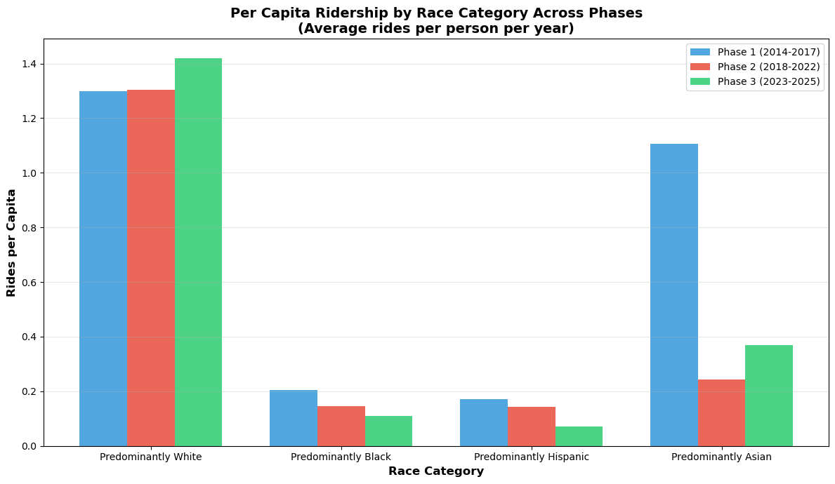
Usage equity did not follow. Per-capita ridership remained roughly 8× higher in Predominantly White tracts than in Predominantly Black tracts through Phase 3, and roughly 15× higher than in Predominantly Hispanic tracts. Physical access is a necessary but not a sufficient condition for utilization.
The highest-growth tracts are high-income and white. All top-ten growth tracts fall in the top income quartile and the Predominantly White category. The gap between access and usage widened over the same period the access gap narrowed.
Limitations
ACS 5-year estimates are rolling averages and do not capture rapid neighborhood change. Some tracts shift racial-majority category between 2017 and 2023, which complicates longitudinal per-tract comparison; the analysis reports aggregate per-group averages to sidestep this. Roughly 20% of historical rides drop out because their start stations are not present in the current station table, which biases older years. Per-capita ridership is computed using tract-level population, so a ride is counted against the tract it started in even if the rider lives elsewhere. The 50% threshold for "Predominantly X" excludes mixed tracts from the comparison rather than resolving them.